Otherwise
Crafting a logo for hardcore AI tinkerers.
Timeline
Spring 2024
Role
Freelance Designer
Tools
Disciplines
OVERVIEW
A group of AI tinkerers once told me:
As developers get deeper into design, the brands they create are ones that designers could never dream up.
I couldn't stop thinking about this and had to take on their branding project. Not because they were wrong, but I wanted to prove that great brand design doesn’t have to come at the cost of developer logic, mindset, or aesthetic. It just has to listen to it.
BACKGROUND
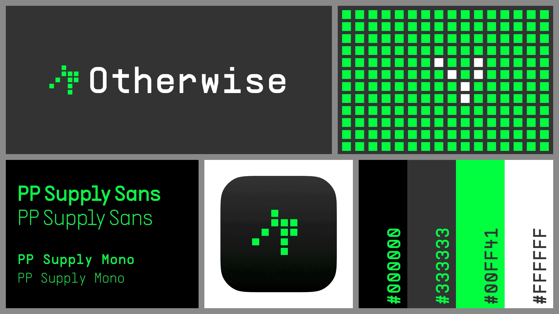
Otherwise is a brand built to speak directly to hardcore AI tinkerers. People who live in terminals, spin up AI agents at midnight, and care less about polish and more about power. From the start, I knew the brand couldn’t feel like “design for design’s sake.” It needed to feel like code. Like logic. Like something they could’ve made themselves.
Here’s how I approached it:
Created a brand noun list with the client—every object, idea, or metaphor that felt close to their ethos.
Explored rough sketches based on that list, focusing on vibe before polish.
Shared a final mark in grayscale—no color, no noise—to validate structure and logic.
Built out a full system with mark, color, and type once the core mark passed the test.
EXPLORATIONS
The initial brand noun list when working with the client had words like AI, Sparkle, Community, Computer, Bug, Brain, Chip, Typewriter, Scroll, Bubble, Window, Keyboard, Infinity, Facial Expression, ASCII. From there, I had a few sketch explorations for what I thought could be interesting.


I explored ASCII patterns, circuit logic, and micro-grids—but nothing quite clicked. It felt like they might be right: maybe designers couldn’t speak this language.
Then I stumbled across Conway’s Game of Life. A grid where simple rules create infinite complexity. On the surface, it’s a grid of cells that live, die, or multiply. But given the right inputs, it forms patterns that evolve forever.
That unlocked everything.
FINAL SOLUTION
The final brand system for Otherwise was generative. Not a logo, but a living identity. I used Conway’s Game of Life to build a mark that evolved based on simple logic. The visuals broke most traditional branding rules. No static grid. No soft storytelling. Just a set of rules and infinite outputs. It felt like code. It looked like chaos. The clients were all in.
LEARNINGS
Polish doesn't always build trust. For a developer audience, too much polish felt like obfuscation. I learned to lean into rawness—letting the logic, not the layout, carry the story.
Constraints aren’t limitations, they’re language. Developers already have a visual grammar: terminals, grids, syntax. As a designer I sometimes forget that tapping into that perspective isn’t limiting, and I had to stop decorating and start speaking their language.
“Designed” doesn’t mean familiar. Good design isn’t always clean lines and center alignment. Sometimes it’s letting complexity show. That’s what makes it honest and viscerally real.
Systems > Assets. Conway’s Game of Life was a structural inspiration. The identity evolved based on inputs and outputs. The Otherwise brand became a system of rules, not a folder of files. That was new for me.
Collaborating with developers changed my process. This wasn’t a make-and-revise loop. It was a two-way build. Feedback sounded more like “this logic breaks here” as opposed to just "this looks off." I had to think like an engineer, defend every pixel, and redesign how I collaborate.