Expense Tracker App
Expense Tracker App
Expense Tracker App
Expense tracker app is my another ongoing personal project, where usability is the highest priority along with the aesthetics to reduce the friction between Ui & Ux.
Expense tracker app is my another ongoing personal project, where usability is the highest priority along with the aesthetics to reduce the friction between Ui & Ux.
Expense tracker app is my another ongoing personal project, where usability is the highest priority along with the aesthetics to reduce the friction between Ui & Ux.
B2C, Mobile App, Fully Responsive, Light Theme
Understanding the problem
Understanding the problem
Well, the idea for this project might seem to be very common, but the challenge was to make it simple and easy in comparison to the existing designs on any platform like behance or dribble. Most of the designs included complex graphs or charts, that even might seem to be aesthetically good, but lacks purpose and increases discomfort for users. Usability was the second most common issue found in most of the designs.
Filling the colors !
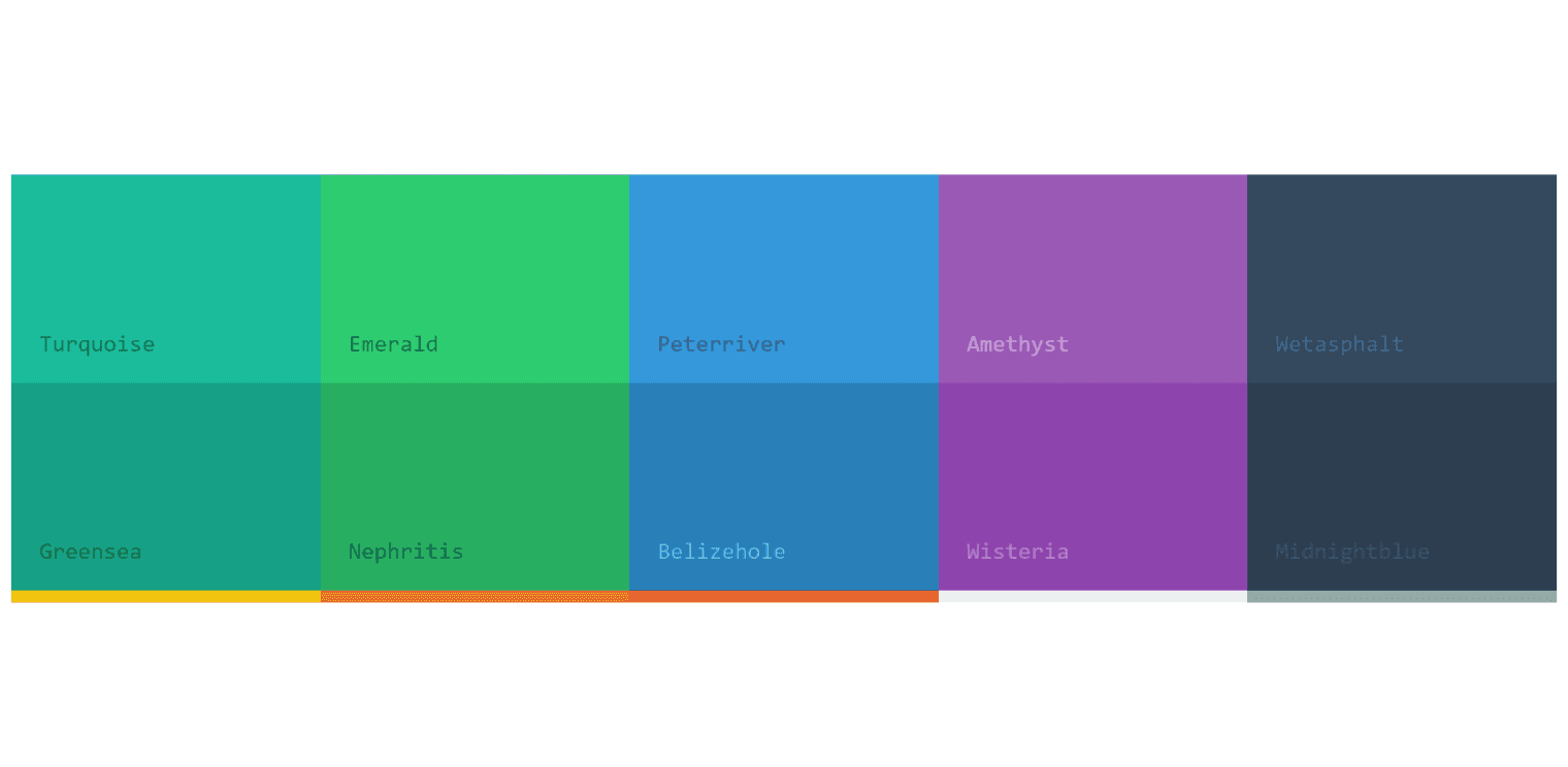
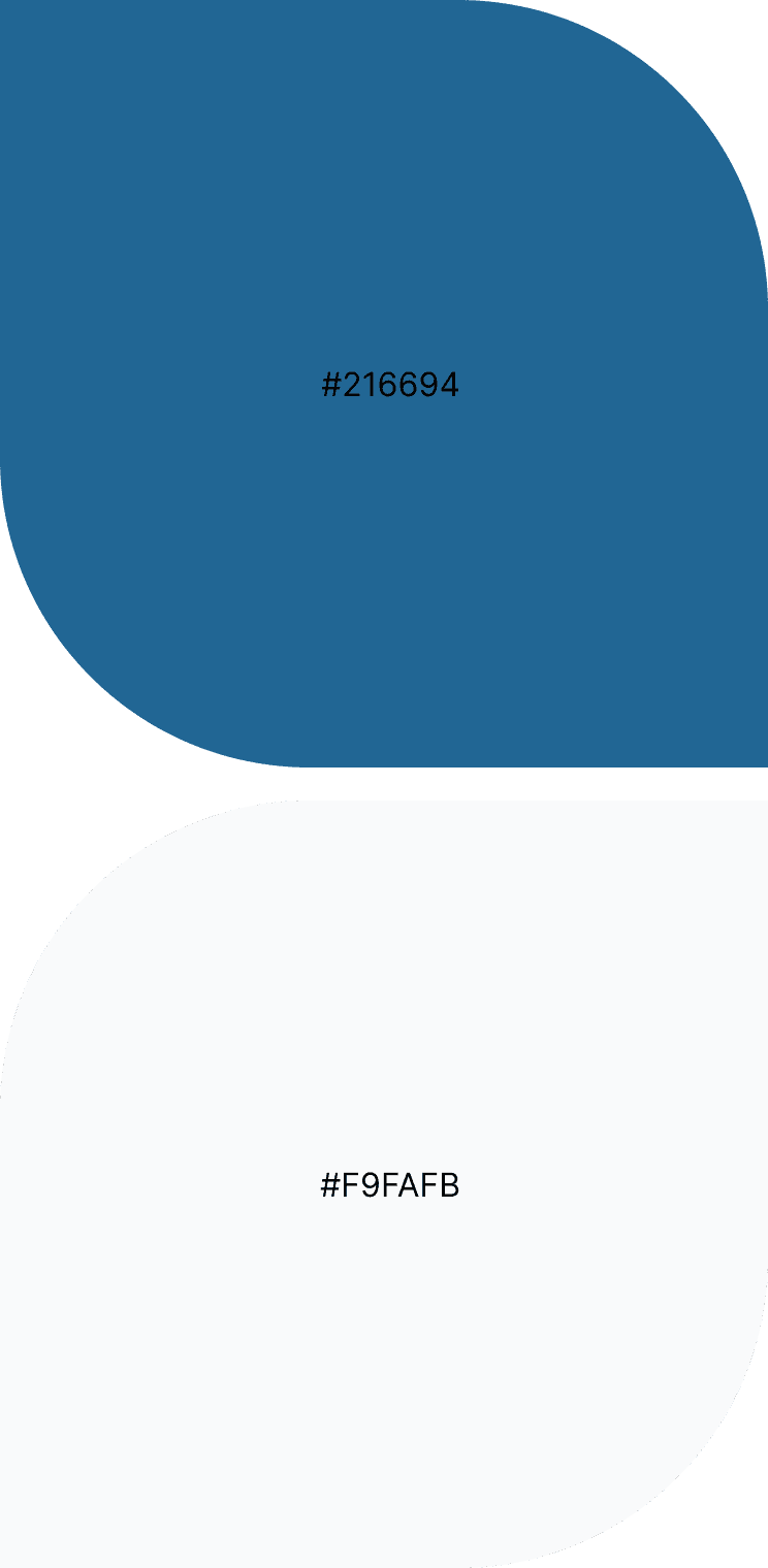
After creating the moodboard and reviewing the existing designs in market, I noticed, that mostly the apps were vibrant green or blue, which makes sense, but it became too common. So I tried to combine them and came up with "Deep Sea Blue" color, which would be standing out from market, and also conveying the premium feeling and comfort to the user. Other than this, I decided, to let the user enjoy the freedom to chose the colors for their expense items, but to maintain the consistency and vibes of app, I limited the options to flat material ui colors.
Filling the colors !
After creating the moodboard and reviewing the existing designs in market, I noticed, that mostly the apps were vibrant green or blue, which makes sense, but it became too common. So I tried to combine them and came up with "Deep Sea Blue" color, which would be standing out from market, and also conveying the premium feeling and comfort to the user. Other than this, I decided, to let the user enjoy the freedom to chose the colors for their expense items, but to maintain the consistency and vibes of app, I limited the options to flat material ui colors.
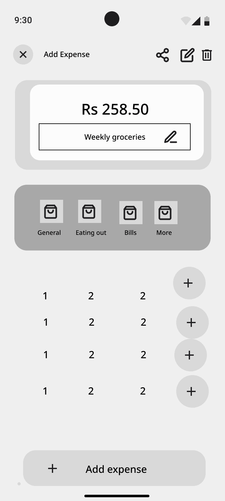
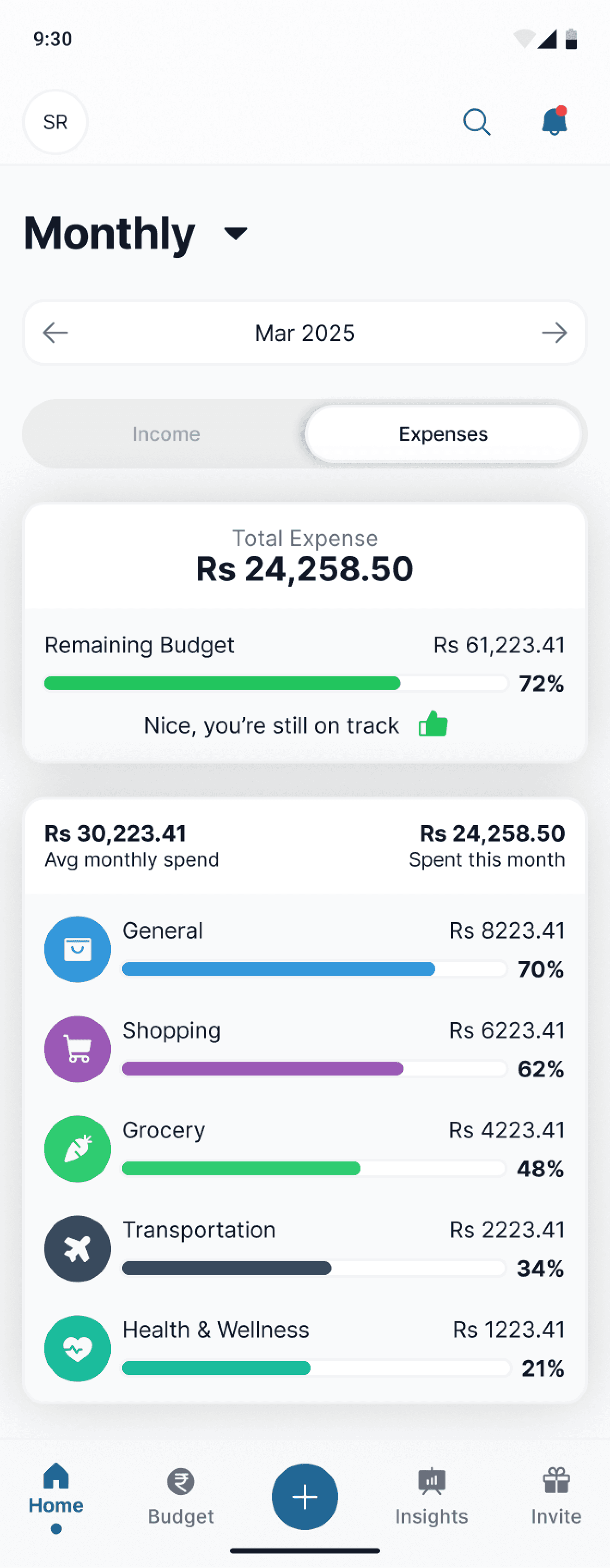
Towards the solution with my design decisions
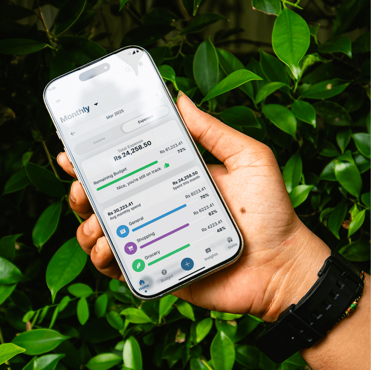
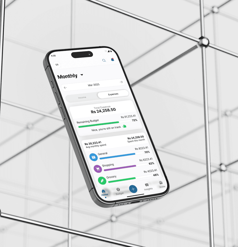
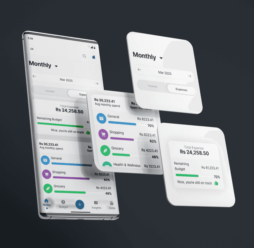
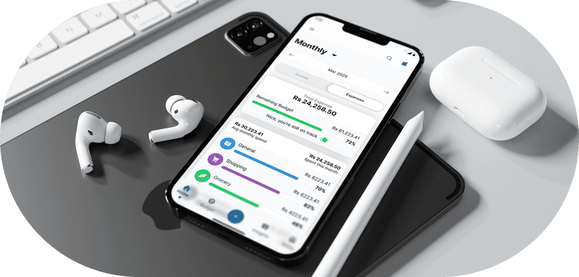
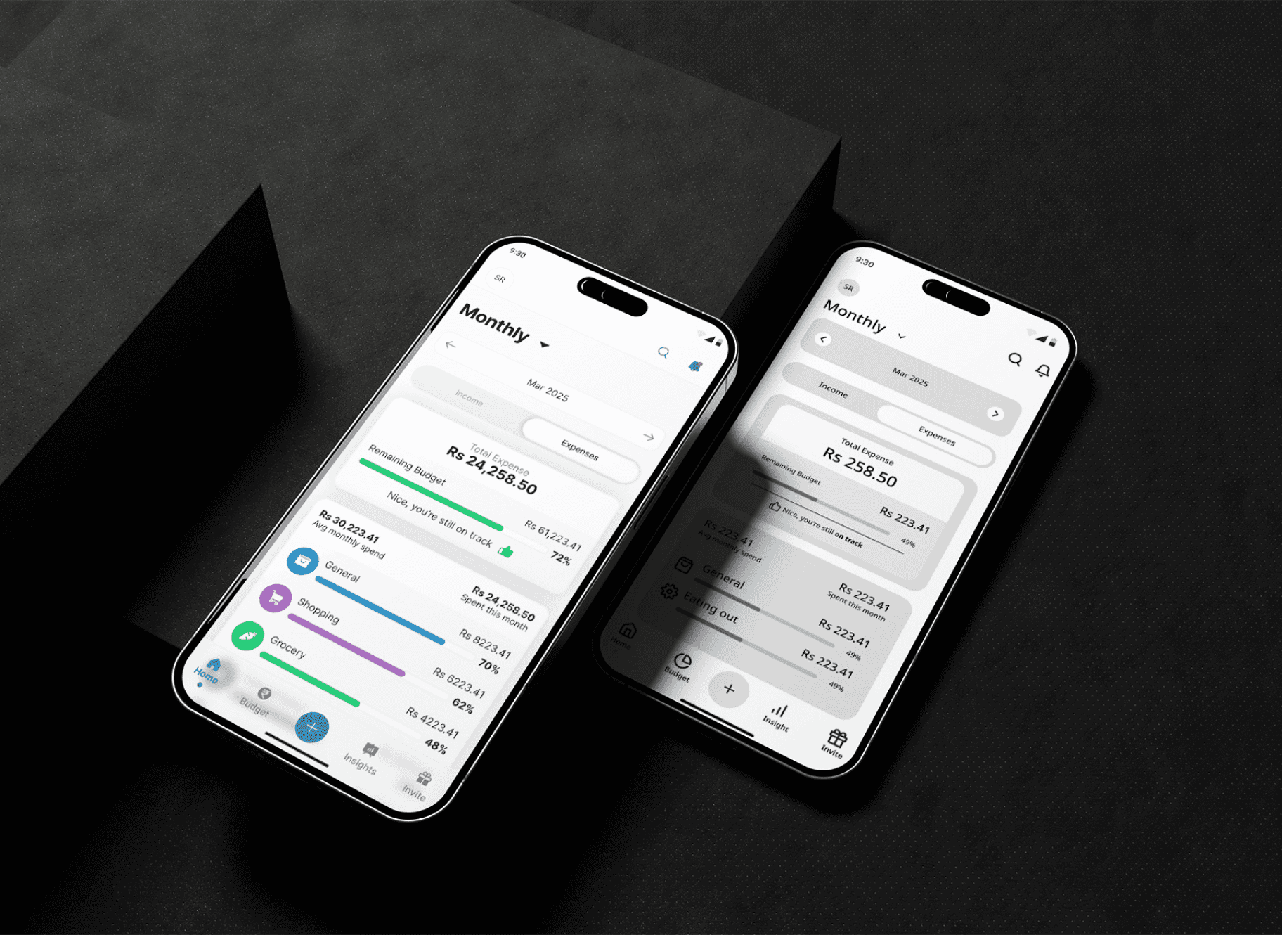
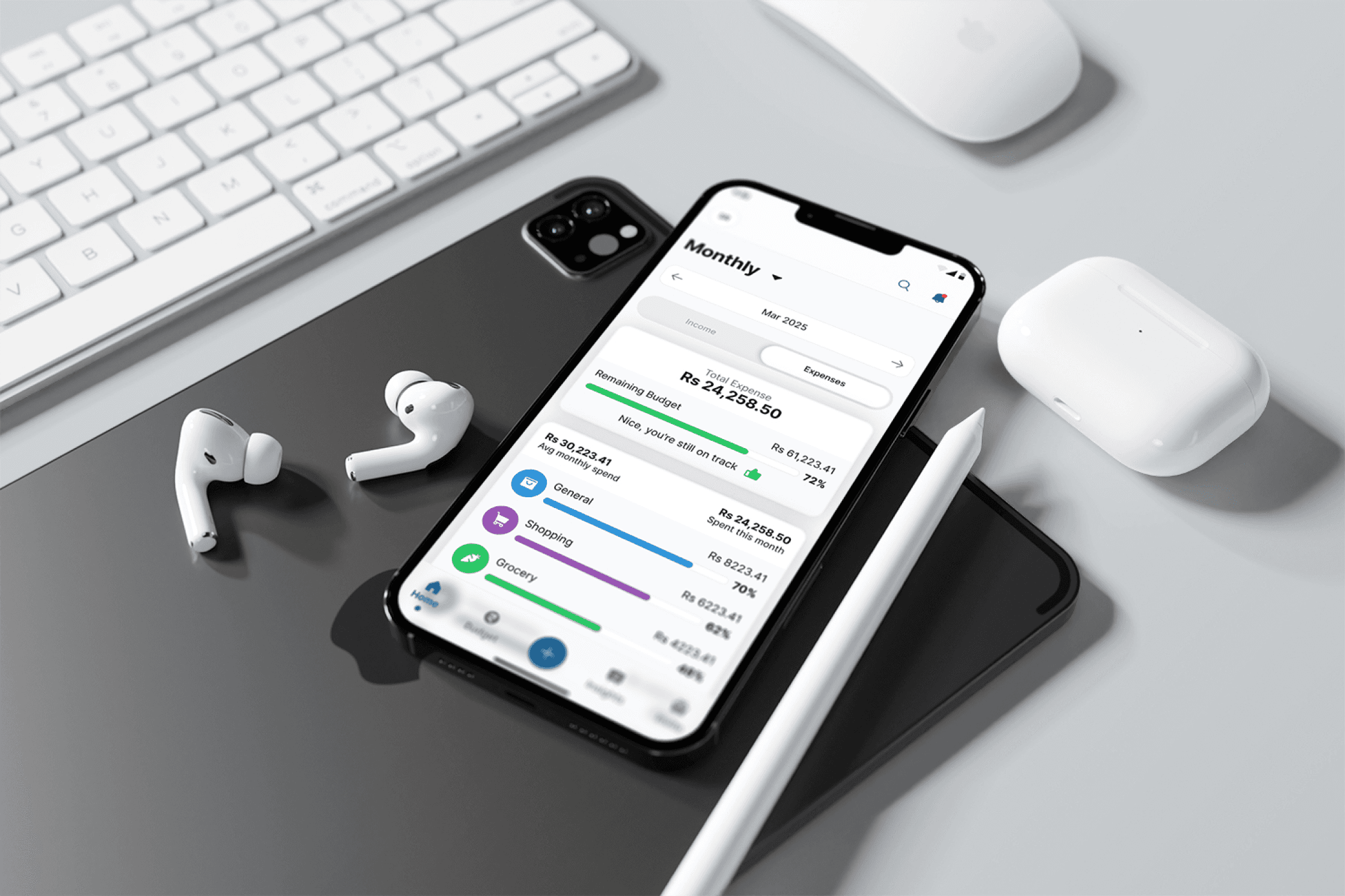
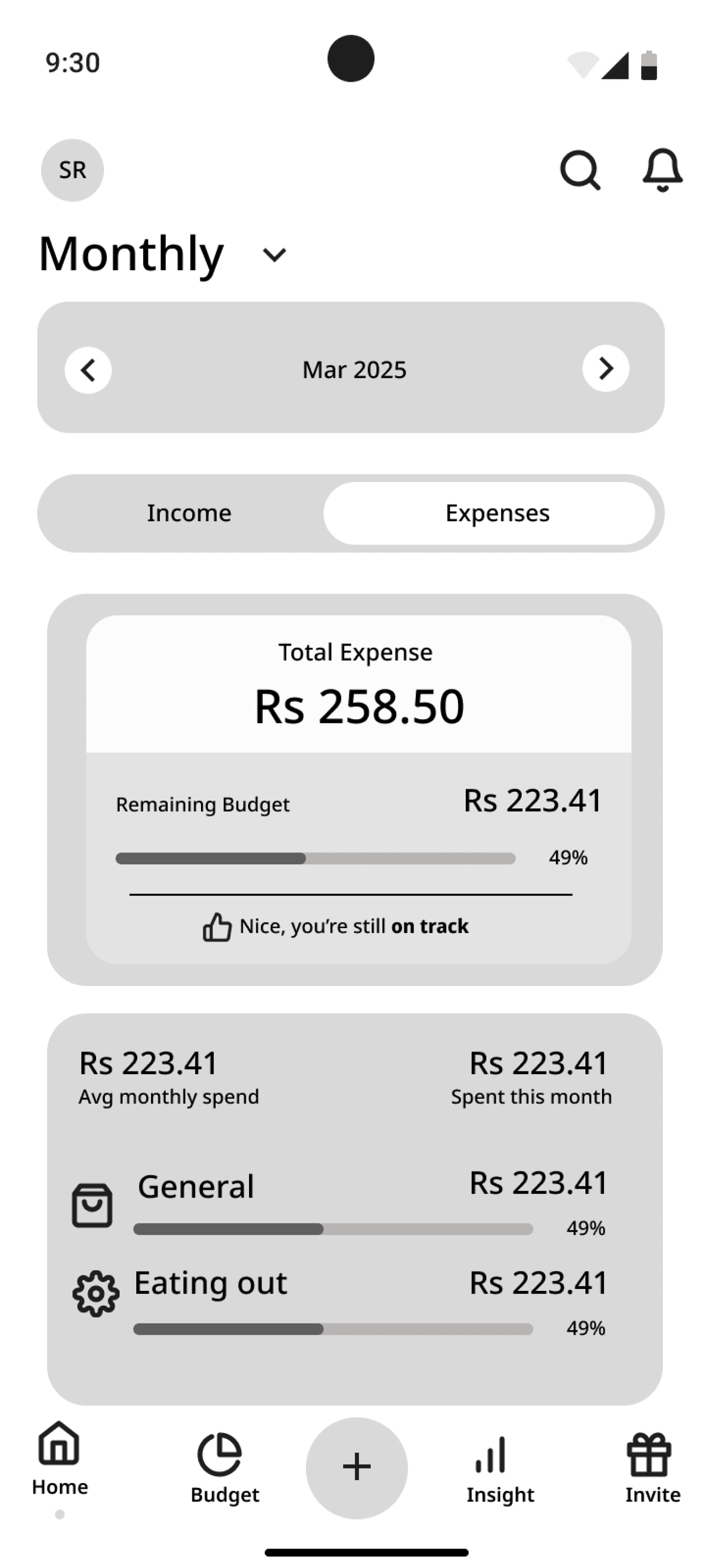
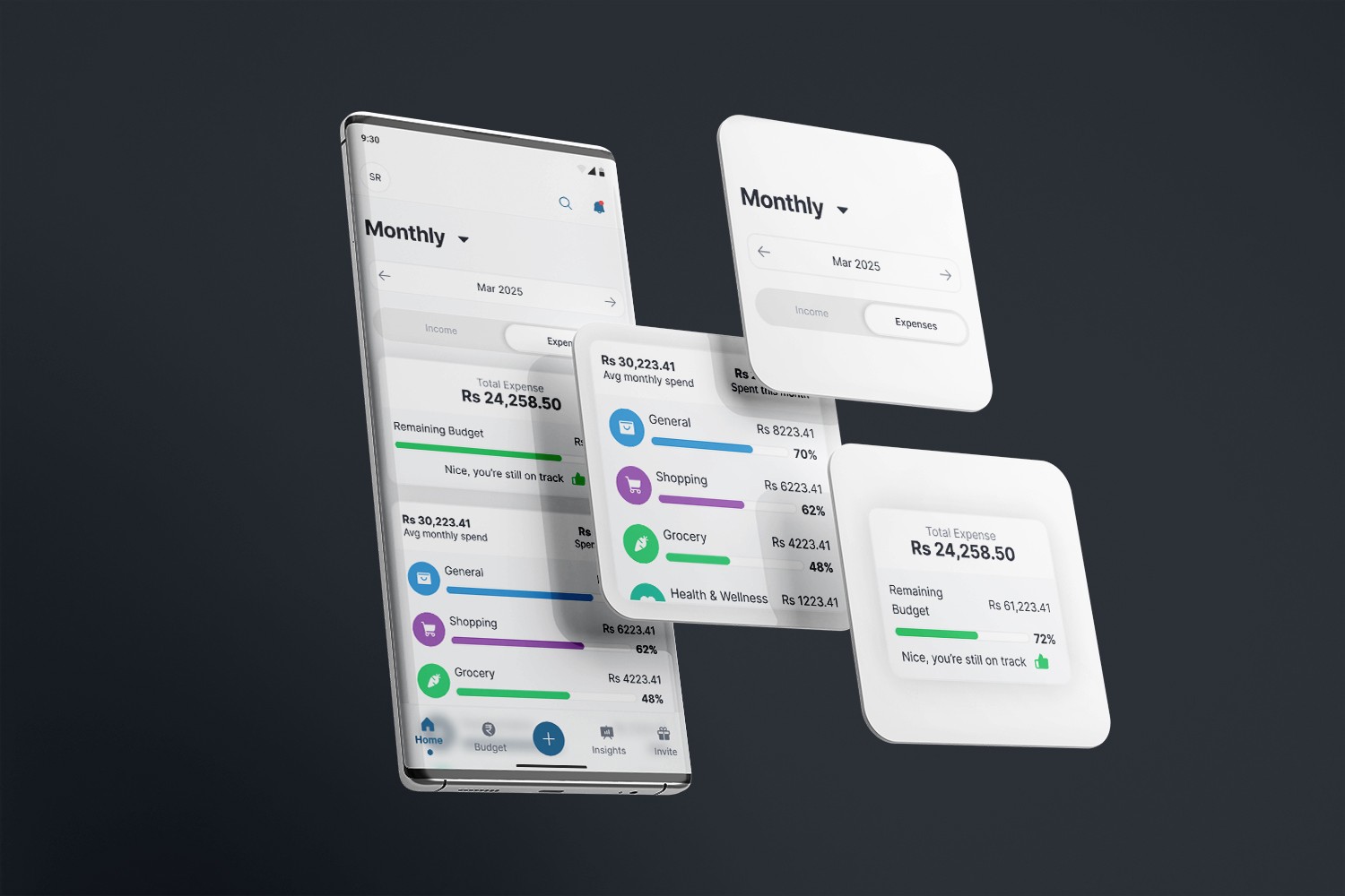
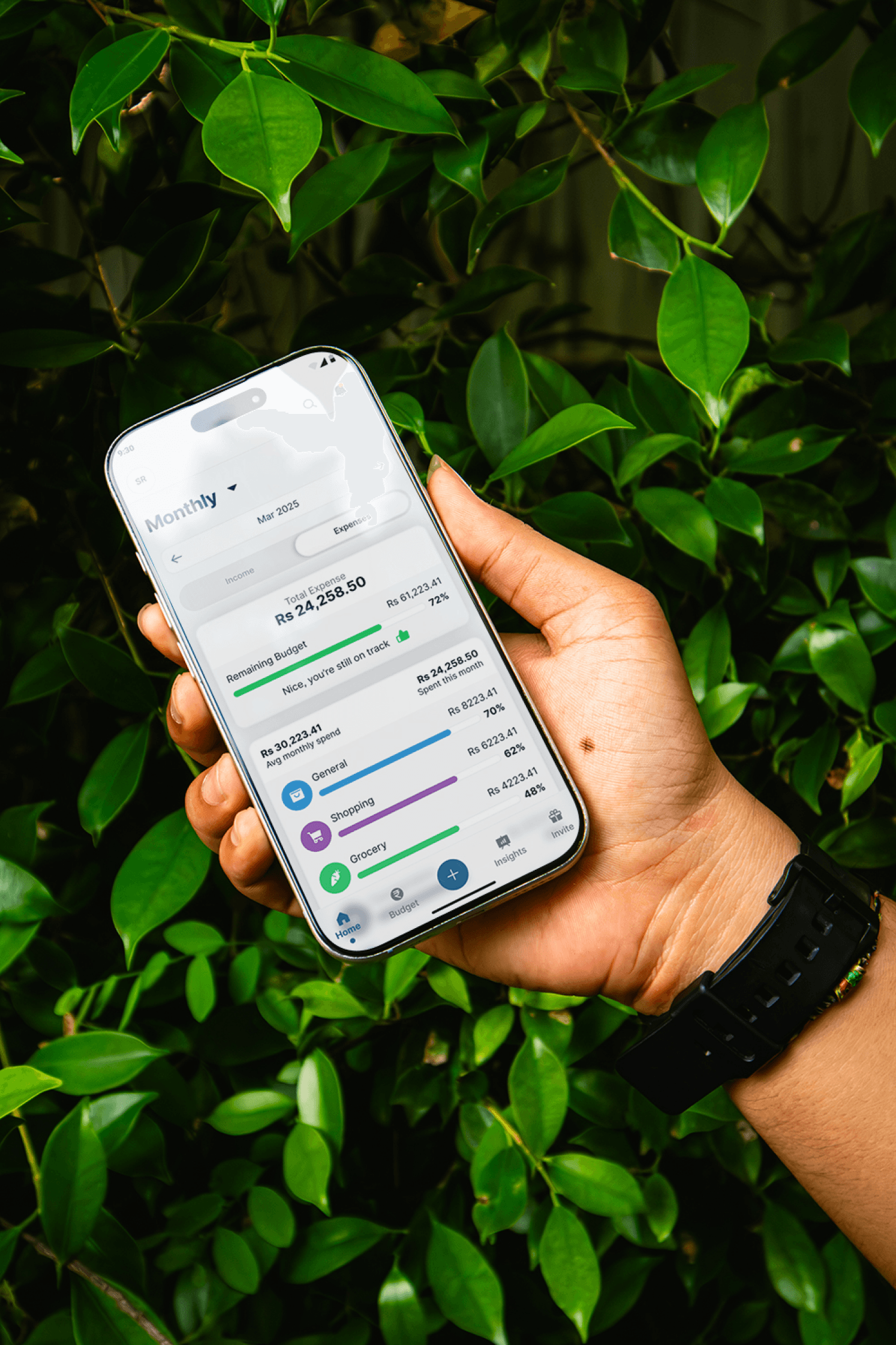
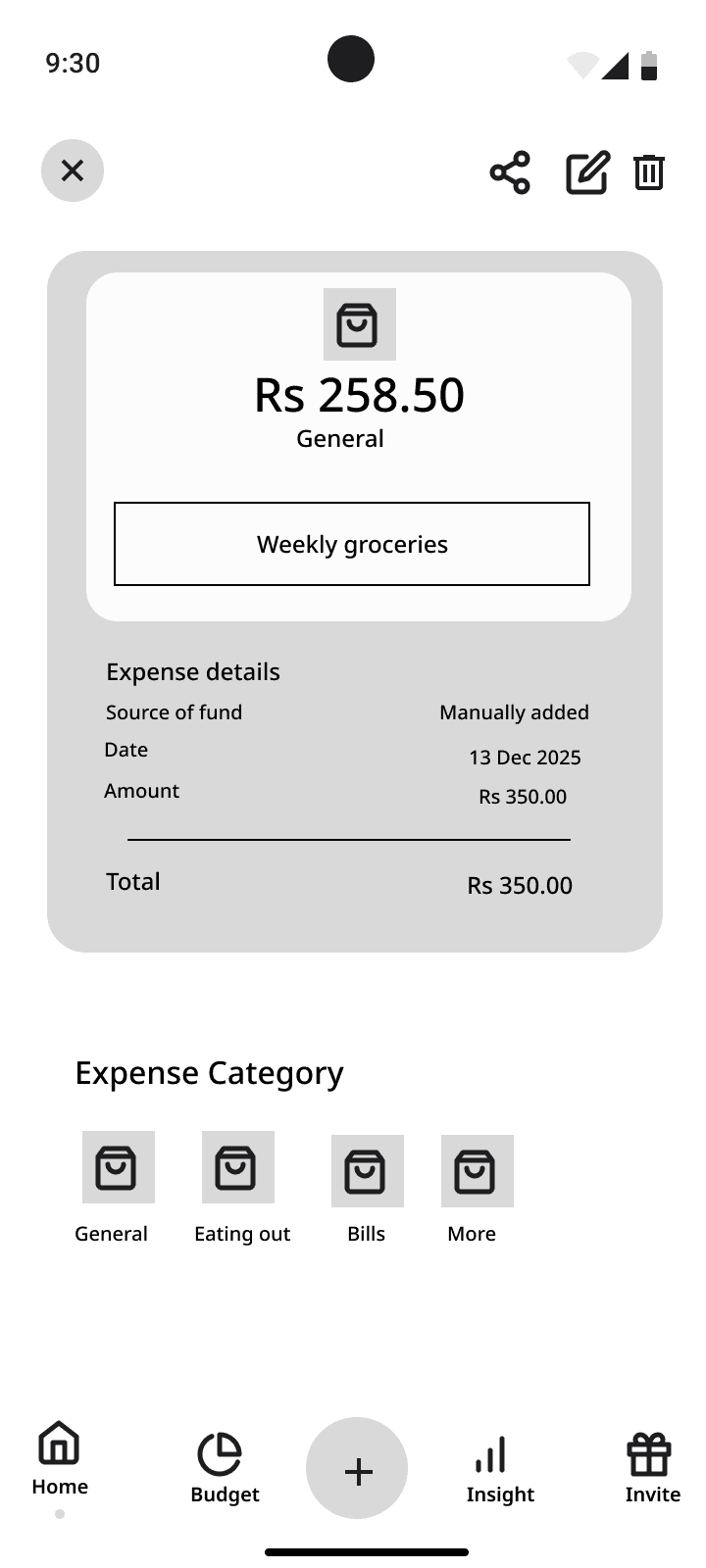
For Infographic problem, rather than using complex charts or graphs, I included a progress bar system which is one of the easiest and effective way to visualize the information. I used hierarchy along with usability to make the overall experience smoother when deciding the order of components.
Towards the solution with my design decisions
For Infographic problem, rather than using complex charts or graphs, I included a progress bar system which is one of the easiest and effective way to visualize the information. I used hierarchy along with usability to make the overall experience smoother when deciding the order of components.
Medium Fidelity to High Fidelity
To me this was a smooth ride, however, I pour my all time in researching the existing designs, and finding the design logics. After that I came up with my own design decisions to improve them further.
Medium Fidelity to High Fidelity
To me this was a smooth ride, however, I pour my all time in researching the existing designs, and finding the design logics. After that I came up with my own design decisions to improve them further.
Medium Fidelity to High Fidelity
To me this was a smooth ride, however, I pour my all time in researching the existing designs, and finding the design logics. After that I came up with my own design decisions to improve them further.
Clean files. Fluid foundations. Built to scale without the rework.
Clean files. Fluid foundations. Built to scale without the rework.
Clean files. Fluid foundations. Built to scale without the rework.
Designed and Build by Shantanu Roy © 2026
Designed and Build by Shantanu Roy © 2026
Designed and Build by Shantanu Roy © 2026